
Homepage
We redesigned the homepage around the way busy parents actually shop — fast, on mobile, with limited patience for clutter. A streamlined hero, clear category entry points, and prominent trust signals (APMA, non-toxic, durability) give first-time visitors everything they need to orient quickly and move toward a product with confidence.

Product Page
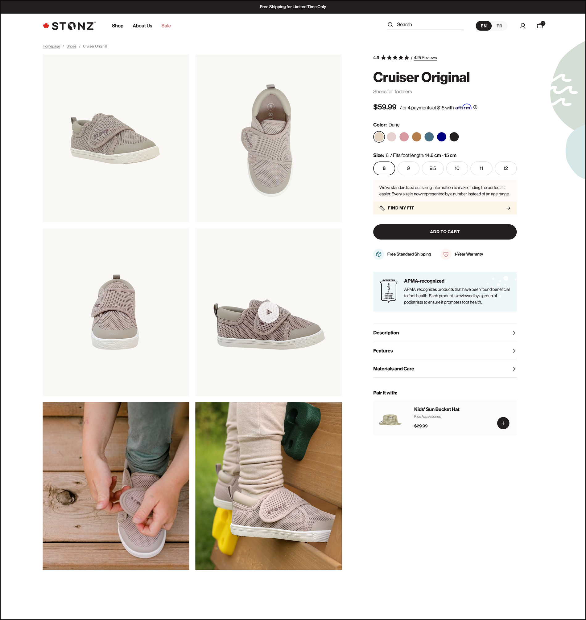
The proof is in the page. Parents land on the Stonz Cruiser Original product page and get everything they need to buy with confidence — no guesswork, no friction. Size selection instantly confirms the foot length fit. Seven colour swatches are always visible. The APMA badge explains itself in plain English. Affirm sits cleanly beneath the price without competing with Add to Cart. And a Rebuy-powered cross-sell surfaces the right complementary product at exactly the right moment. Every element was deliberate — and every one is live.


Shoppers find what they need in seconds. Whether on desktop or mobile, Stonz's navigation puts the full product range immediately within reach. The desktop mega-menu opens to reveal category subcategories, a featured product card, and a direct 'Shop All' path — all without leaving the page. On mobile, the same structure translates into a clean drawer navigation with product imagery, giving phone shoppers the same clarity and speed. The 'Sale' tab sits prominently in the main navigation in red, exactly where deal-seekers expect it. Every path into the catalogue is one click — no hunting, no dead ends.
B2b Features


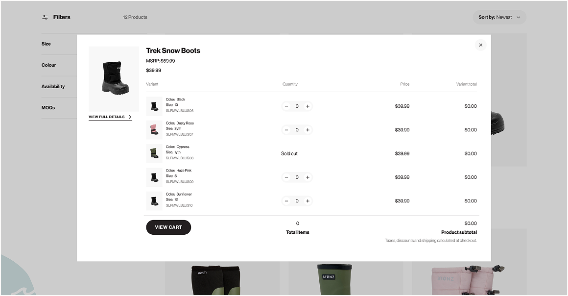
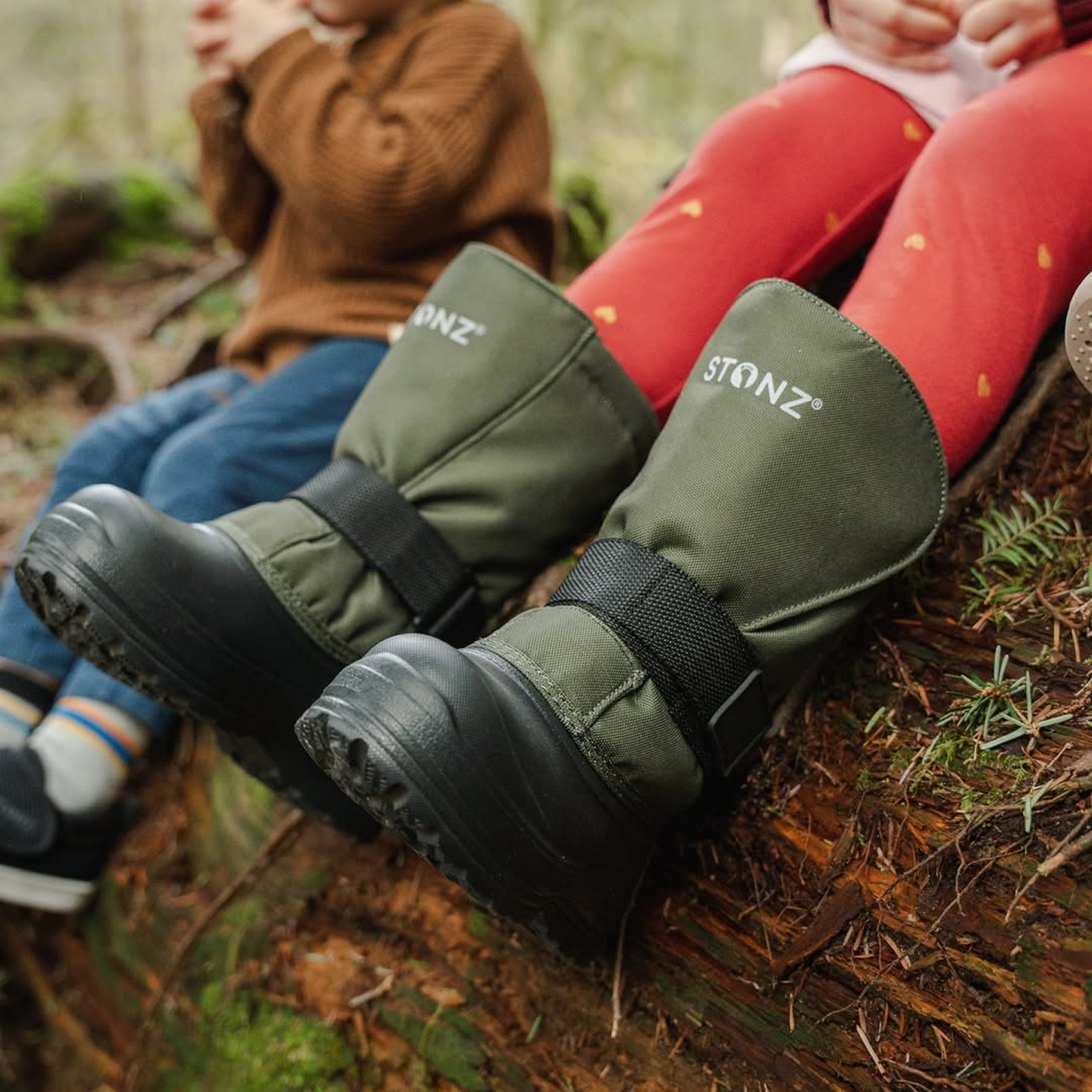
Parents browsing the Rain Boots, Winter Boots & Booties collection get a shopping experience built around how they actually make decisions — subcategory tiles to orient quickly, key product credentials (Waterproof, Natural Rubber, For Low Temperatures) surfaced upfront, and filters for size, colour, availability, and MOQs that cut straight to what's relevant. Wholesale buyers get an entirely different but equally considered experience: a clean inquiry form to start the partnership conversation, and a streamlined order matrix showing every size, colour, and price variant in a single view — no back-and-forth, no confusion. Two audiences, two journeys, one platform built to serve both without compromise.
responSive design


Beyond the core shopping experience, every corner of the Stonz site received the same level of care. Product category pages give parents an immediate, editorial entry point into the range.
The About Us page turns CEO's founding story into genuine brand loyalty. A Community page channels real parent voices and user-generated content, turning social proof into a brand asset.
And supporting pages — FAQs, size guides, product care, shipping and returns — all carry the same mobile-first clarity as the rest of the site. The result is a site that doesn't just sell — it represents a brand worth believing in.


