What we do

See all services → Shopify Plus Partner


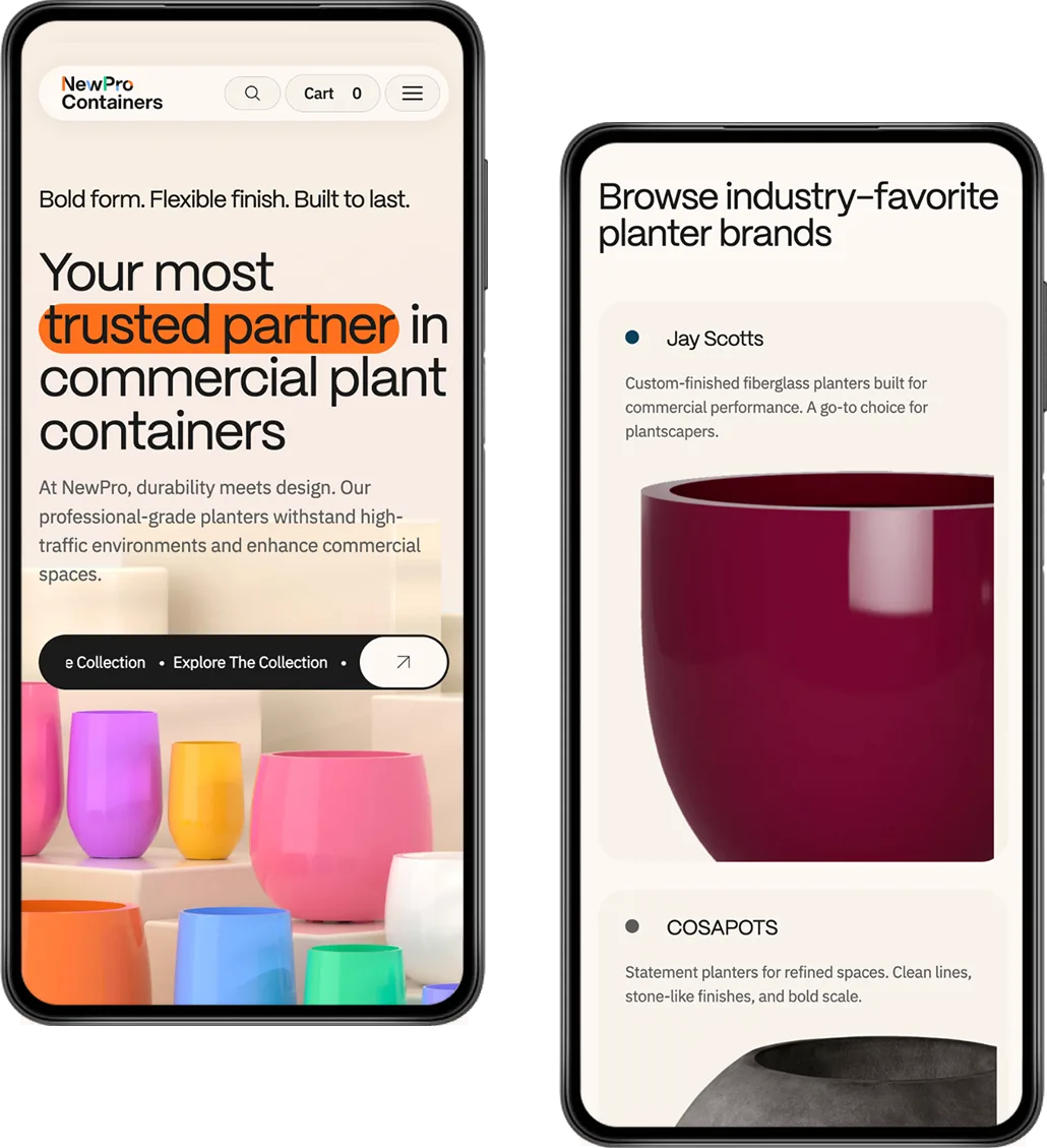
Collection Page
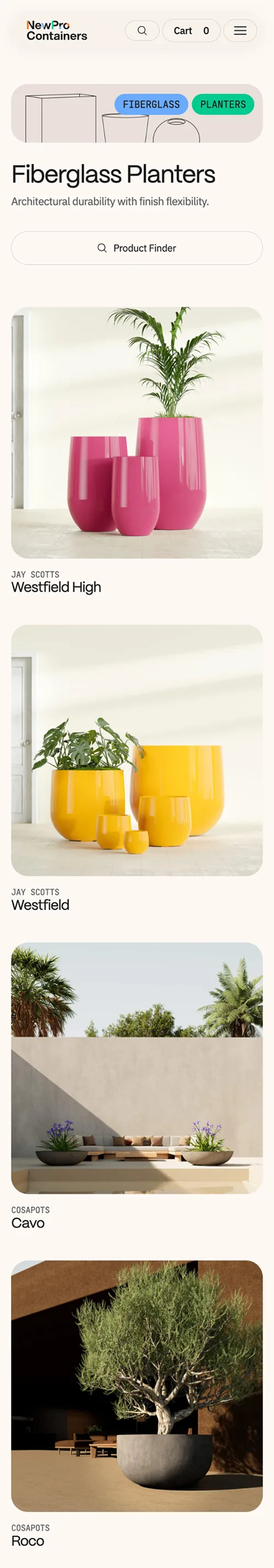
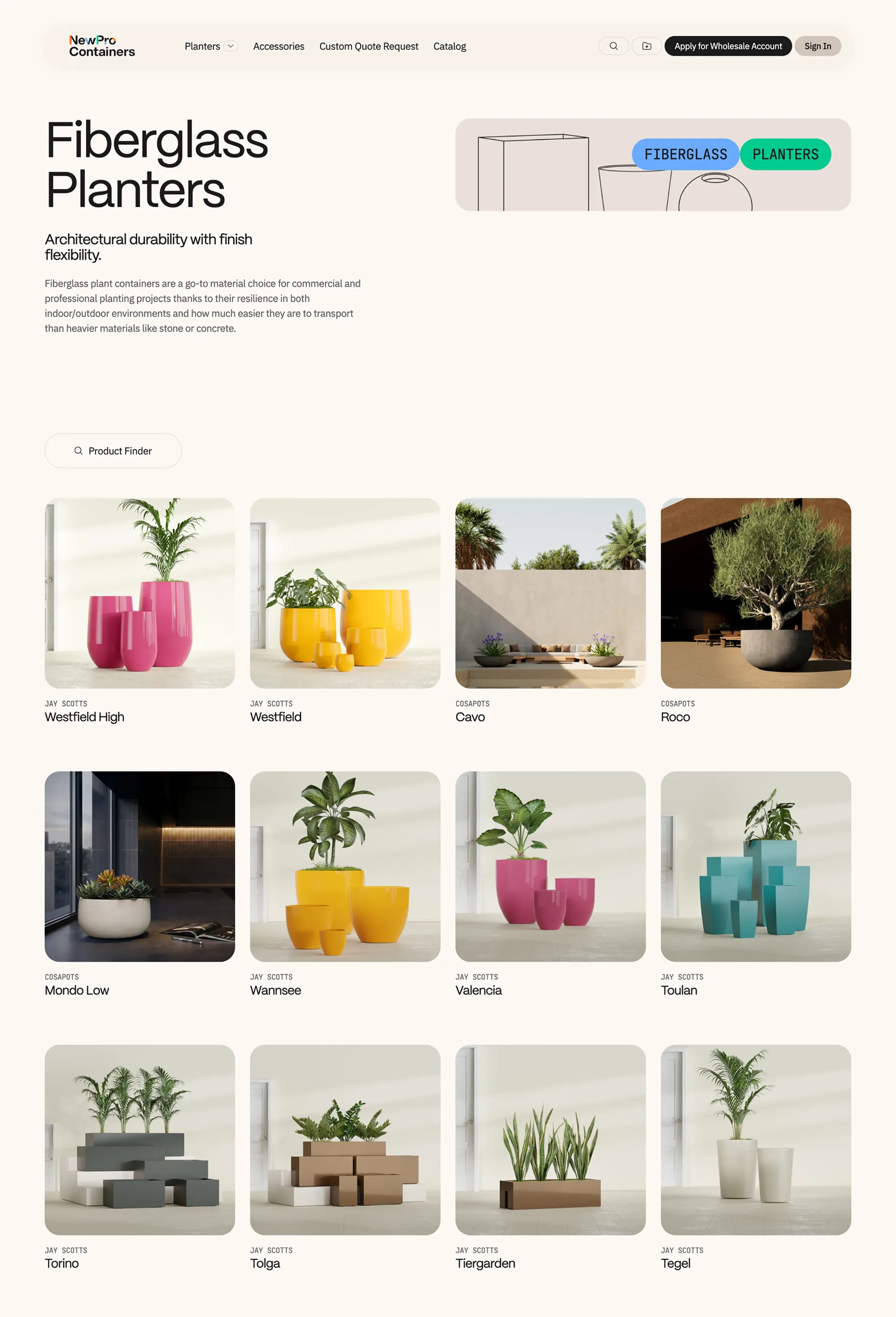
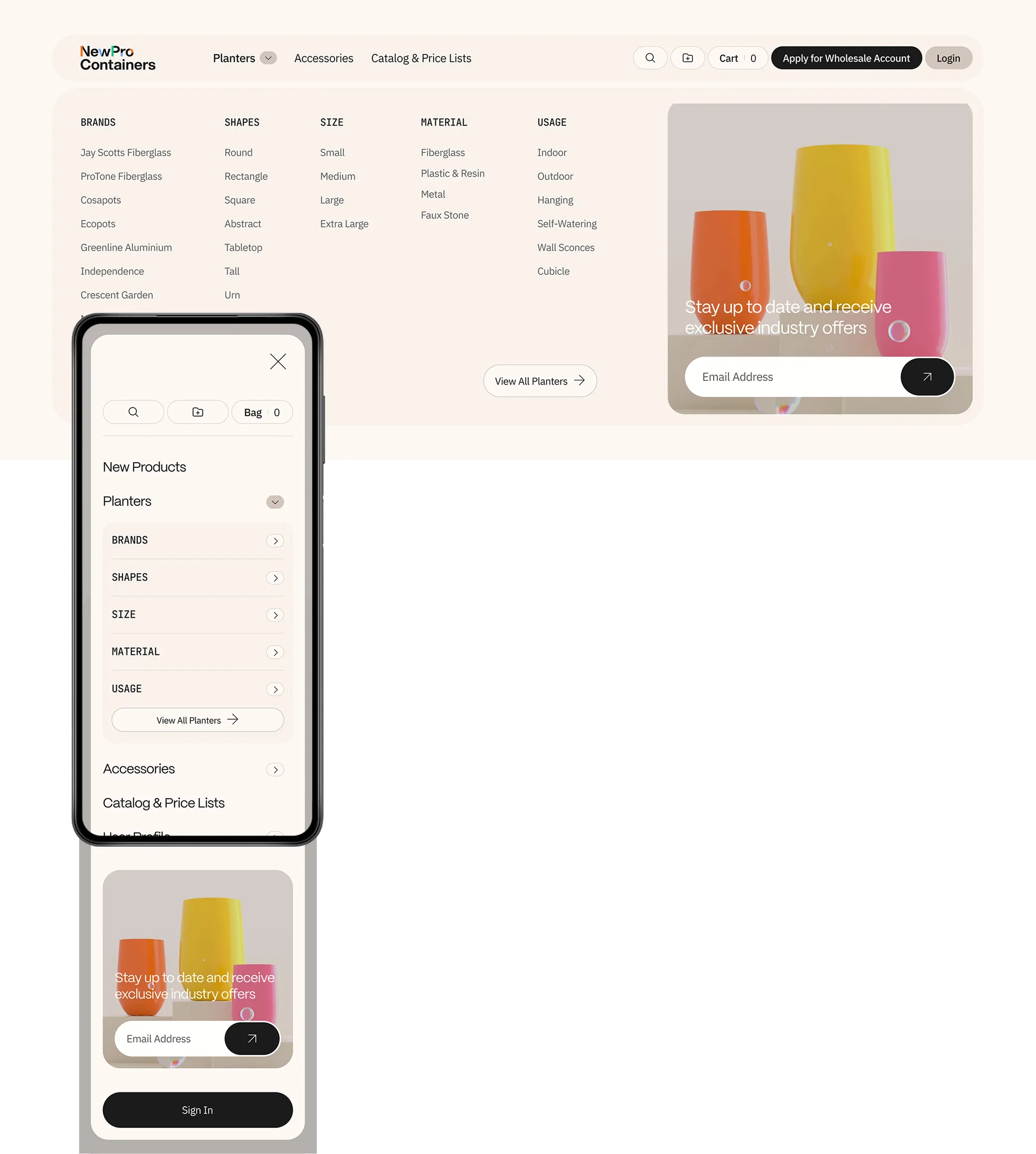
Every great purchase begins with discovery; and for NewPro's trade buyers, that moment needed to feel effortless. We reimagined the collection page as a curated editorial experience, replacing the tired filter-and-scroll approach with a richly layered landing template where stacked product grids sit alongside purposeful subheadings and an inviting Product Finder entry point.
Active filters now live as elegant removable pills above the grid, a quiet but powerful detail that keeps buyers oriented without ever breaking their flow. We brought colour swatches out of hiding, moving them from a desktop hover state to permanently visible, because a trade professional shouldn't have to interact with a card just to know what's available.
And in renaming the colour filter from "Color" to "Color Family," we addressed something deeper than terminology: we eliminated the moment of doubt that occurs when a selected swatch doesn't perfectly match the delivered product. It's a small linguistic shift that builds enormous trust.
product Page
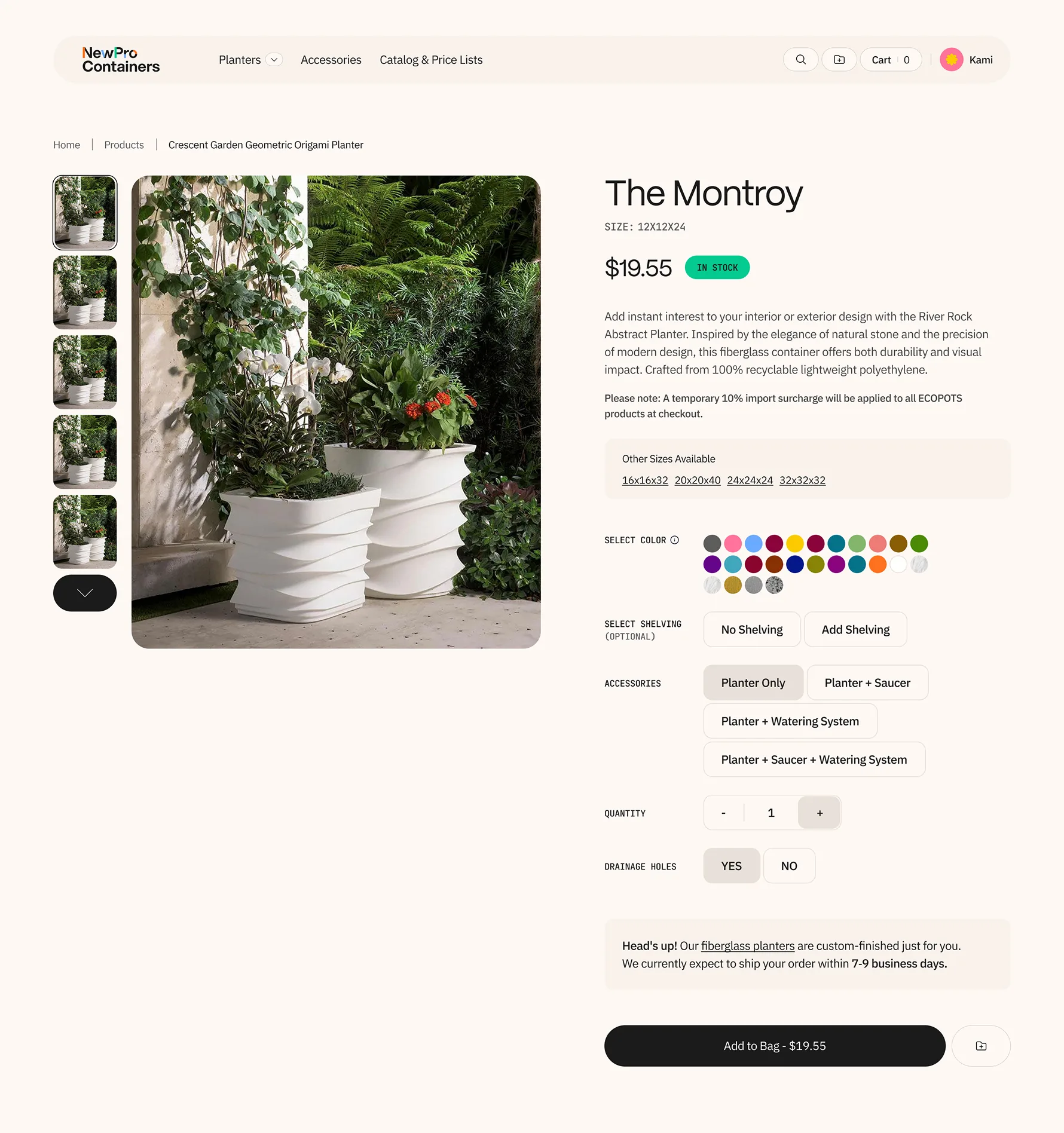
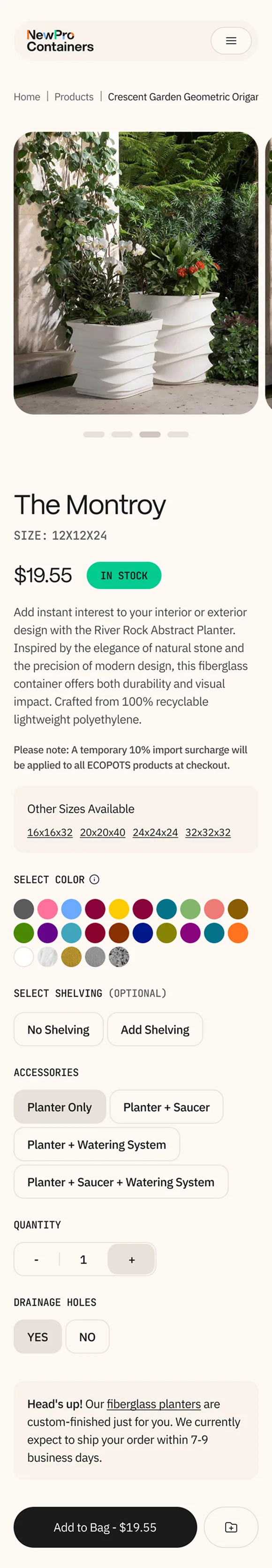
The product detail page is where consideration becomes commitment, and for a catalogue built around style families with dozens of size variants, that page has to do serious work.
We restructured the entire hierarchy, elevating the style name to its rightful place as the primary heading, with the specific size rendered as a clear secondary detail, so buyers instantly understand both what they're looking at and where it lives within the broader family.
A new "Other Sizes Available" component was woven directly into the buying area, turning what was once a frustrating back-button journey into a single click.
The image gallery was rebuilt from the ground up: gone is the unconventional layout that risked cropping the very products buyers came to evaluate, replaced by an intuitive main-image-and-thumbnail carousel that lets the product speak for itself. And across every option, Accessories, Shelving, Drainage, we introduced a unified button-style selector, bringing consistency and clarity to choices that previously required unnecessary clicks and guesswork.
Search Results
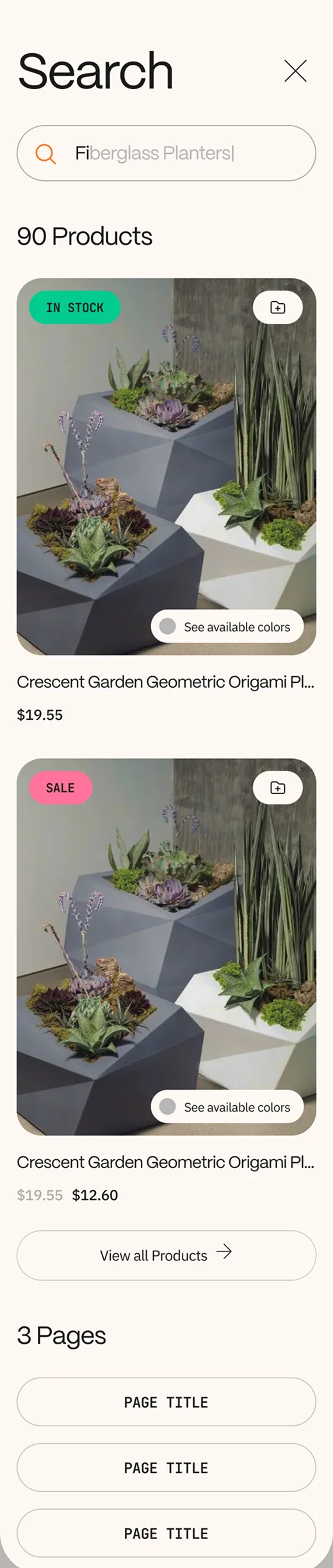
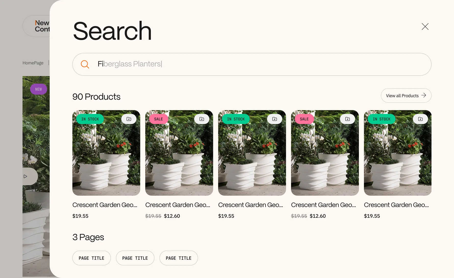
When a trade buyer types a query into a search bar, they're not browsing, they're hunting.
We redesigned the search experience around that intent, restructuring results so purchasable products appear first and prominently, complete with stock status badges, pricing, and sale indicators, while supporting editorial and category pages are pushed to a clearly secondary section below.
It's a hierarchy that respects the buyer's time and mirrors their mindset: show me what I can buy, then show me everything else. On both desktop and mobile, a "View all Products" link sits at the top of the results, offering a clean escape to the full catalogue when the initial results don't quite land.
The result is a search experience that feels less like a database query and more like a knowledgeable colleague pulling the right options forward.
Account
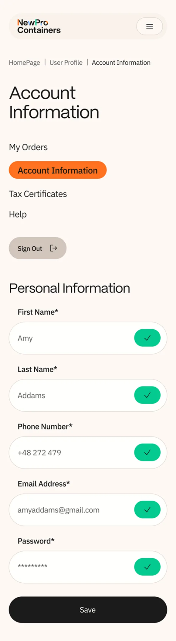
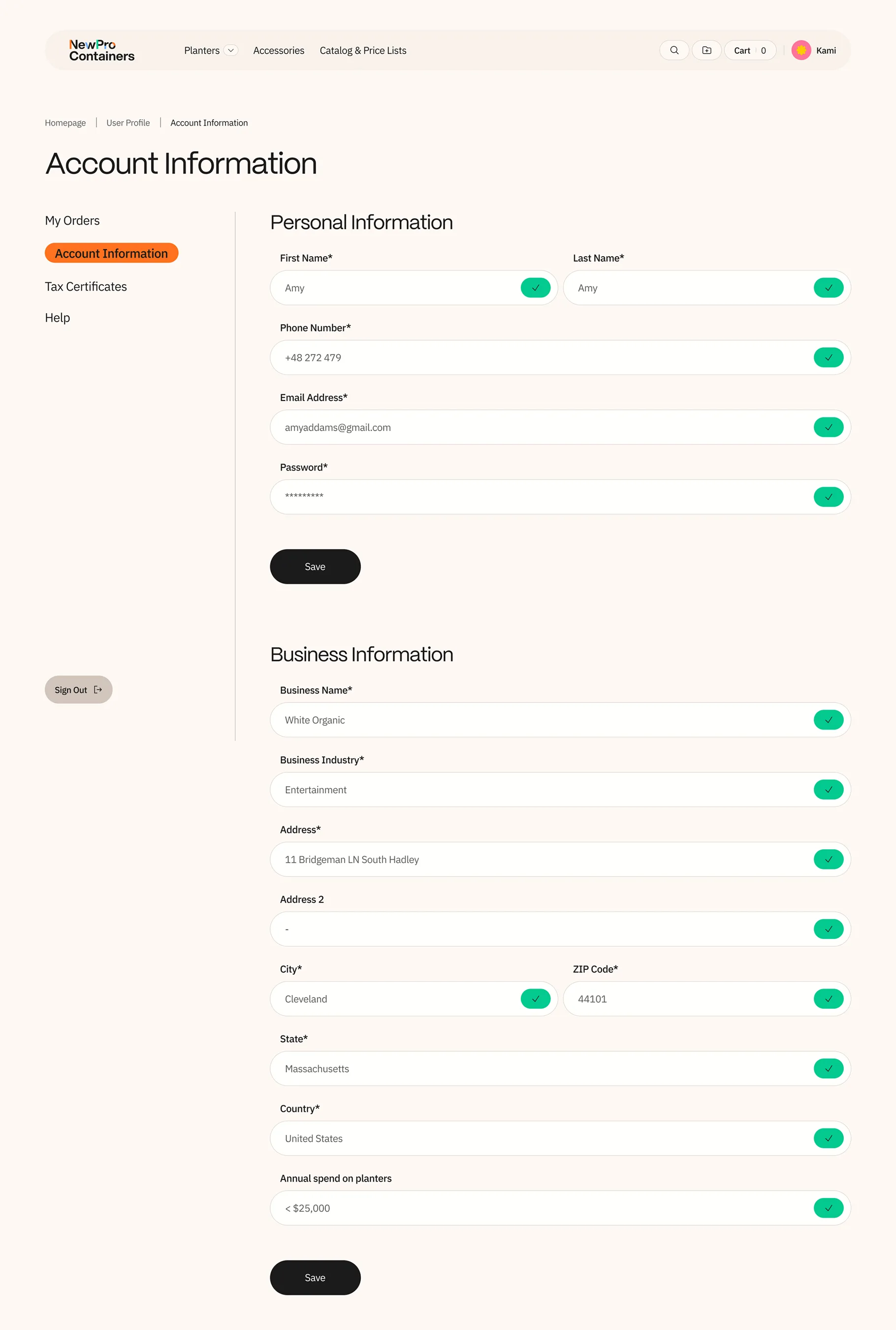
Managing an account should never feel like paperwork. We took what had been two separate pages, one for personal details, another for business information, and unified them into a single, streamlined view that respects the reality of how busy professionals manage their profiles.
Everything lives in one scroll: name, phone, email, and password at the top, with business name, industry, full address, and annual spend below, each field equipped with inline editing so changes happen in place without navigating away.
A persistent sidebar keeps the account's key sections, Orders, Account Information, Tax Certificates, Help, always within reach.
On mobile, the same structure holds, stacked cleanly and fully functional, because a trade buyer updating their details between site visits shouldn't have to wait until they're back at a desktop.
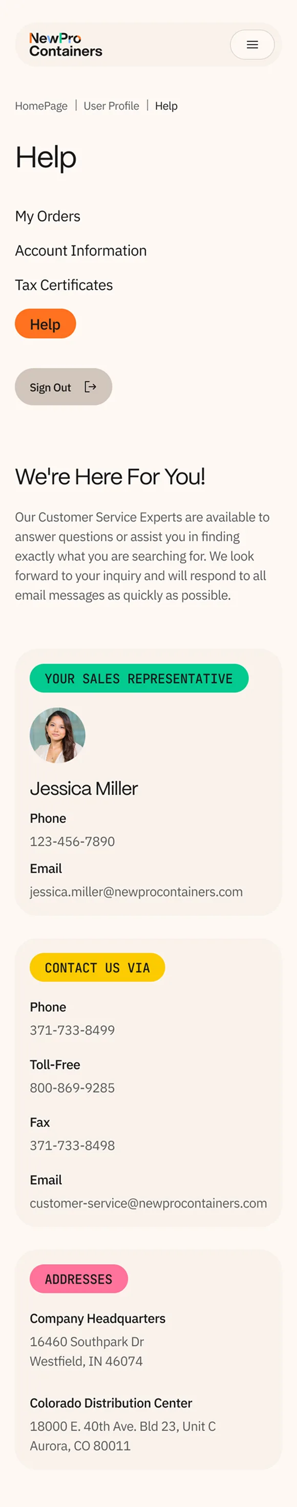
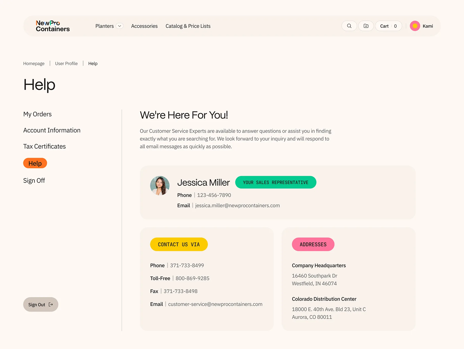
In B2B, the relationship is the product, and a Help page should reflect that. We transformed what is typically a forgettable support page into a personalised hub that puts the buyer's assigned sales representative front and centre: name, photo, phone number, and email, all immediately visible.
It's a small moment with outsized impact, the kind of detail that makes a wholesale buyer feel known, not processed.
Below, every contact channel is consolidated in one clean layout: phone, toll-free, fax, email, and physical addresses for both headquarters and the distribution centre. No hunting, no dead ends.
The data is maintained manually on an annual cadence, keeping the technical footprint light while delivering a high-touch experience that reinforces the human partnership at the heart of every NewPro account.
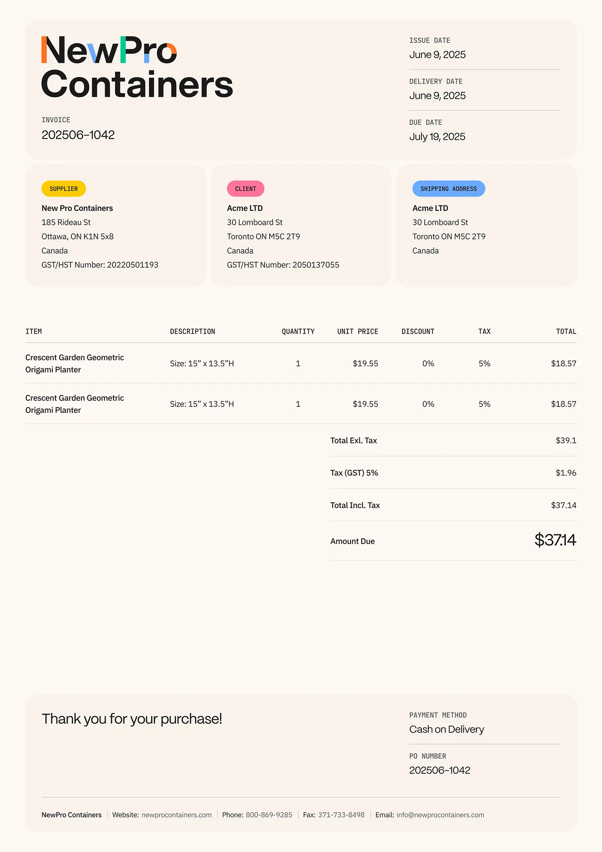
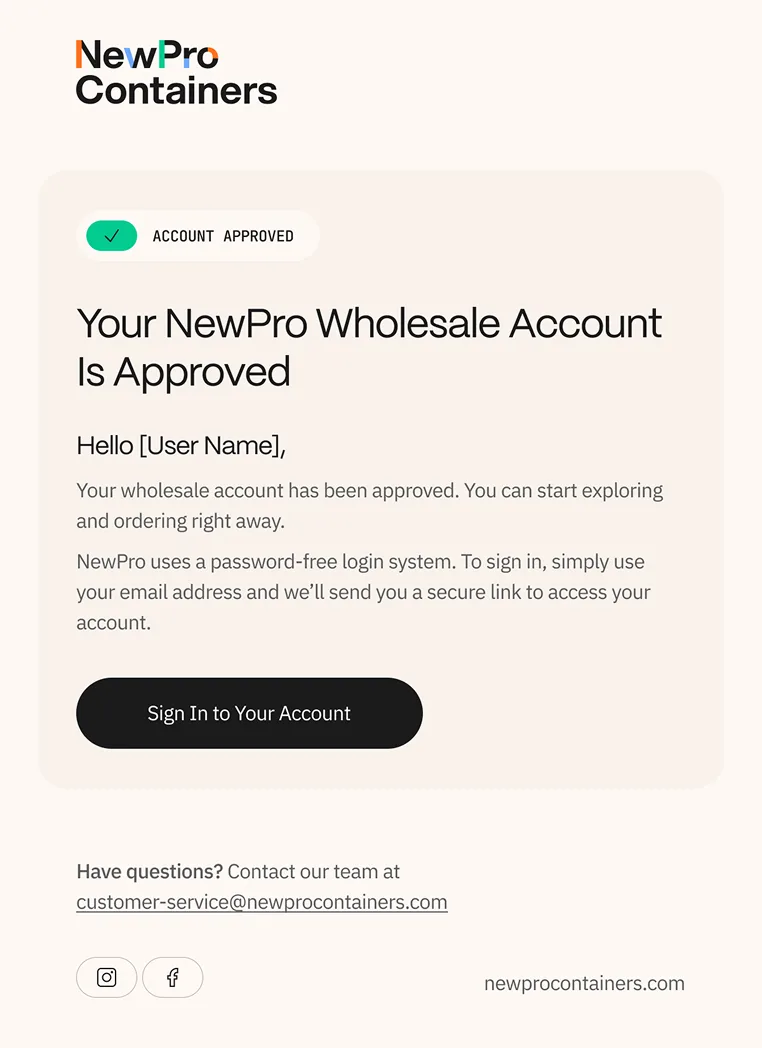
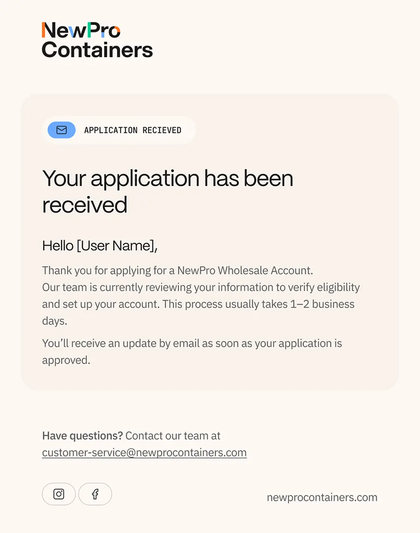
A brand doesn't end at the checkout, it travels with every document, every email, every shared link.
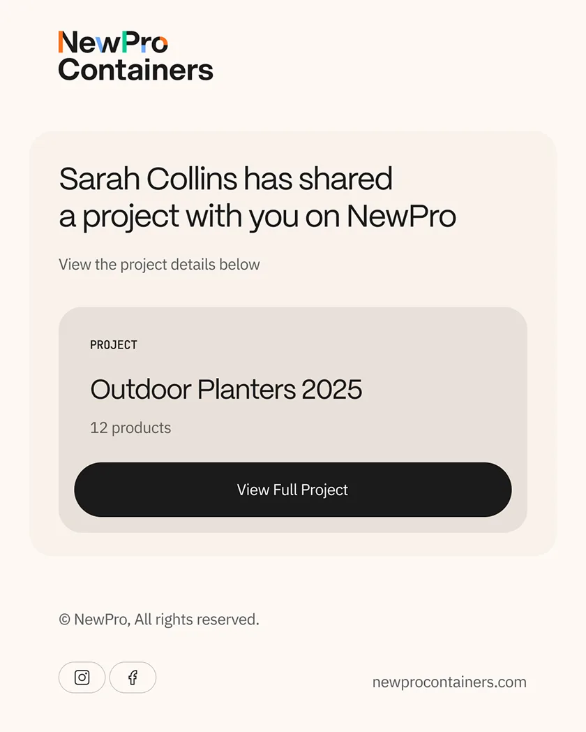
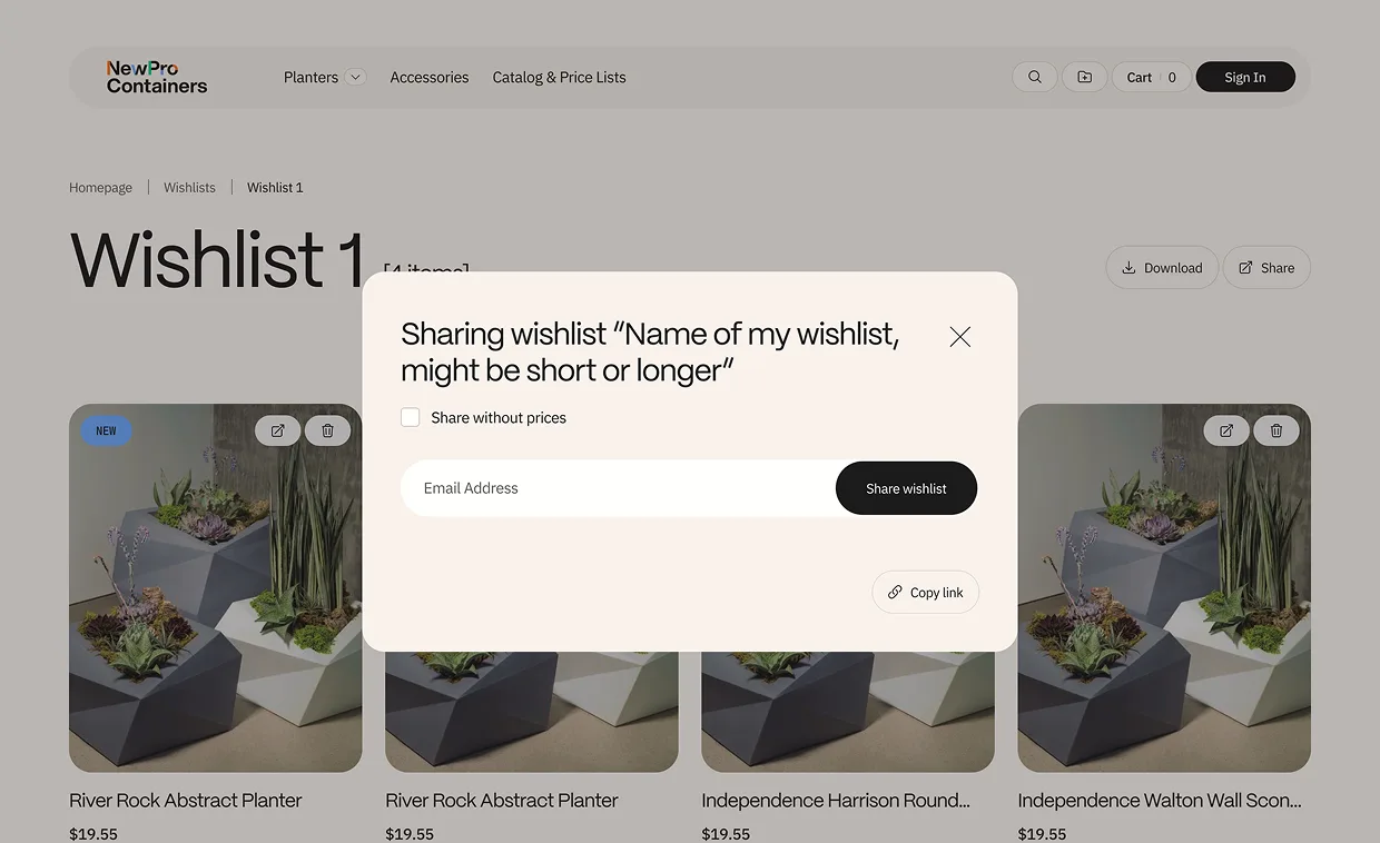
We renamed the wishlist feature to "Projects" because that's how trade professionals think: they're not saving favourites, they're assembling specifications for a real-world job.
The sharing experience was designed to match, with an elegant toggle that lets buyers strip pricing before sending a project to their own clients, a small act of control that elevates them from customer to curator. The invoice was rebuilt as a brand moment in its own right: structured, confident, and unmistakably NewPro, because a beautifully designed invoice doesn't just communicate what's owed, it influences how quickly it gets paid.
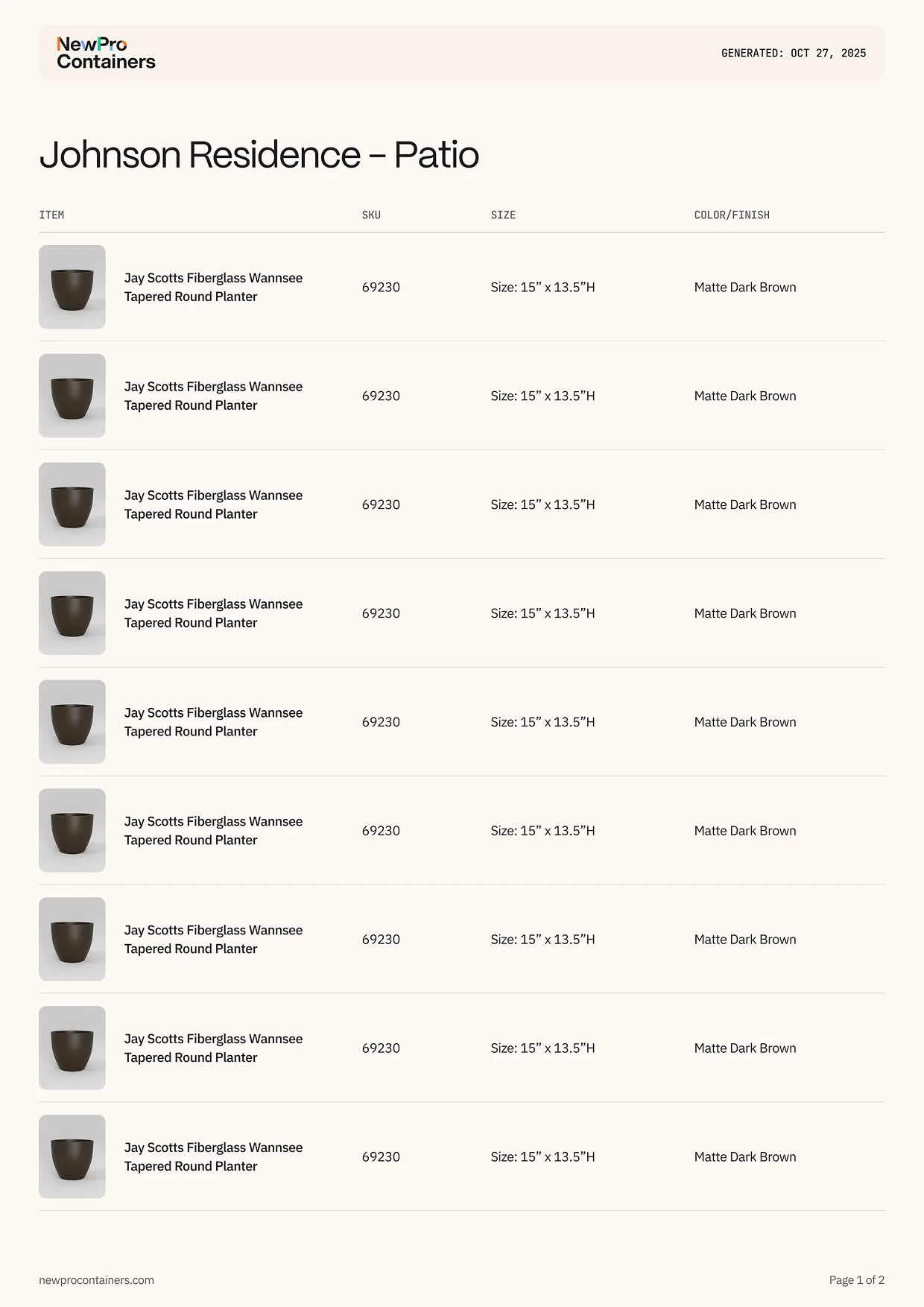
And the project sheet carries that same polish, pairing item thumbnails with SKUs, sizes, and finishes in a format that positions NewPro not as a vendor, but as a partner worth building with.